Huawei Watch 3 Review: A premium smartwatch, but HarmonyOS is a work-in-progress
Last month Huawei held a virtual launch event that saw the official global launch of HarmonyOS, the company’s new operating system developed in response to the U.S. government’s ban. Alongside the software announcement, Huawei also announced a slew of new hardware that will be among the first Huawei products to run the new OS, including the
Huawei Watch 3
series.
Just what
is
HarmonyOS? XDA’s Adam Conway has tried it out on the
MatePad Pro
tablet, and found that, aesthetically, it’s not a radical departure from
EMUI
, Huawei’s previous Android-based operating system. Well, I’ve been testing the new Huawei Watch 3 running HarmonyOS, and the difference between the smartwatch version of the new OS and Huawei’s previous LiteOS software is also hard to grasp. But that’s not necessarily a bad thing.
About this review:
Huawei sent us the Huawei Watch 3 for review. However, they did not have any inputs in the content of this review.
Huawei Watch 3: Design and Hardware
Huawei is certainly a tech brand that draws many divided opinions. But if there’s one thing everyone can agree on, it’s that Huawei makes
damn good hardware.
The company that’s pioneered a lot of the camera hardware tech in mobile phones we see today has made some beautiful devices over the years, and the Huawei Watch 3 is yet another one.
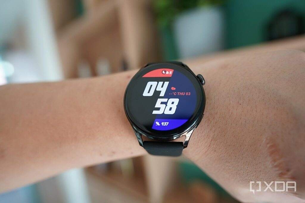
The Watch 3’s overall design philosophy hasn’t changed much from the first Huawei Watch released in 2015: it’s still a circular body crafted out of stainless steel mixed with a bit of ceramic around the back, with an overall look that resembles a traditional timepiece.
New to this model is the addition of a digital crown that can be pressed or rotated (yes, just like on the
Apple Watch
), and a slightly curved OLED screen that blends seamlessly into the body, making for a smoother, more natural-feeling swiping experience when navigating the UI.
The 1.43-inch OLED display is sharp and vibrant with a PPI of 326, and better yet: maximum brightness reaches 1,000 nits, making it as bright as the Apple Watch 6 and noticeably easier to see under direct sunlight than my Fitbit Sense and
TicWatch Pro 3.
The screen also refreshes at 60Hz.
Straps are removable and come in either rubber, leather, or a Milanese band depending on the model you choose.

Inside the Watch 3 are the usual sensors like an optical heart rate sensor and accelerometer that tracks everything from heart rate to workouts, but there’s also a new body temperature and Spo2 sensor to track potential fever and blood-oxygen levels.
There’s also 16GB of storage, and a speaker that pumps out loud sound. At the cost of all this hardware is a rather thick watch at 12.15mm. This along with the large 46mm casing makes the Huawei Watch 3 a masculine watch that probably looks weird on slimmer wrists.
The Huawei Watch 3 (right) is a bit thicker than the Apple Watch 6 (left).
Huawei Watch 3: Software and Performance
As mentioned, the Huawei Watch 3 is among the first batch of Huawei products released globally to run on HarmonyOS, but if Huawei hadn’t prominently namedropped HarmonyOS inside the software — on the Watch, HarmonyOS gets its own billing screen during bootup — I’m not sure most people would even notice the software has changed.
For the most part, the software running here looks similar in aesthetics to the LiteOS that’s been running on Huawei’s smartwatches the past couple of years, except HarmonyOS is more polished and brings a couple of new features that previous Huawei wearables didn’t offer.
For example, animations on the Huawei Watch 3 look and feel
very smooth.
Part of this is the 60Hz screen, but it’s also because software is well optimized. The animation when pulling down the shortcut toggle menu (a swipe down from the top of the screen) in particular looks buttery smooth, reminding me of the first time I used the OnePlus 7 Pro (which was one of the first smartphones to go with a higher refresh rate display). Other than the Apple Watch, no other smartwatch I’ve tested has animations this fluid and aesthetically pleasing.
There’s also Huawei’s app store, named the App Gallery, built into the watch that allows searching for and downloading apps on the device itself. Unfortunately, the App Gallery on the Watch is very barebones right now, with almost all obscure, no-name apps listed.
Luckily, the Huawei Watch 3 includes all the essential apps you’d need to track workouts, sleep, monitor skin temperature, and make voice calls (the device supports eSIM, although I have not tried this feature).
Most of these health tracking apps won’t just show you the last result, but also allow you to read through previous results over a few weeks too. For sleep, it even shows in-depth sleep breakdown including time spent in deep sleep or light sleep.
I wore the Huawei Watch 3 with the Apple Watch 6 and Fitbit Sense for half a day and all the basic metric tracking such as step count and heart rate are similar across the board, which should mean Huawei’s sensors are accurate enough.
However, the way HarmonyOS on the Watch 3 decides to show its apps is a direct clone of the Apple Watch’s — I’m just not a fan of blatantly lifting a design aesthetic from Apple, whose products are so mainstream that it only draws attention to the unoriginal nature of the design.
Other pros and cons of previous Huawei smartwatches still carry over to the new wearable. Let’s start with the good: the Huawei Watch 3 can easily go four full days on a single charge (the Apple Watch 6 and Galaxy Watch 3, by comparison, can go a day-and-half at most). The Huawei Watch 3 also supports wireless charging, which makes topping up easier.
On the bad side, this new watch still can only receive static notifications, with no way to interact with them. For example, on an Apple Watch, if I get a Telegram message, I can respond directly on my wrist; I can’t do that on the Huawei Watch 3.
Huawei Watch 3: Conclusion
Despite the marketing of an entirely new OS, my experience with the Huawei Watch 3 is similar to my experience testing previous Huawei smartwatches — meaning I adore the premium, gorgeous hardware but am let down by the software. In particular, I really need my smartwatches to be able to respond to notifications because if I’m wearing a somewhat bulky device, I need it to be able to make me check my phone less. Otherwise, if I just need fitness tracking, I can wear a smaller/sleeker fitness brand, like the superb
Huawei/
Honor Band 6
.
But there are people who enjoy wearing luxury watches as a fashion accessory, and the Huawei Watch 3 is among the most classy and handsome circular smartwatches right now.
Huawei Watch 3
Huawei's latest smartwatch offers a gorgeous screen, long battery life, and a new operating system with potential for growth.
View at Amazon
